How To – Fonts

What is a Handlettered Font? Learn More!

What Is a Handlettered Font?

If youโ€™ve ever wondered what makes a handlettered font different from a regular font, the short answer is pretty simple: I actually handletter it. Ya know, write it. Not create it with a mouse doing a little clicky-clicky on my computer. (The clicky part comes later.) It almost feels silly to consider writing a blog like this, but leave no stone unturned, right?

Iโ€™m immersed in the hand lettered font world on the daily, so it seems second nature to me to know what a hand lettered font is and why itโ€™s different from other types of fonts. But every expert was once a beginner, and understanding the creation process might help you down the road! Iโ€™m talking to you, craftersโ€ฆgraphic designersโ€ฆanyone with an interest in lettering, letterforms, fonts, calligraphy. You get the point.

A handlettered font starts with actual lettering drawn by hand rather than being designed entirely from shapes, curves, and anchor points. That gives the finished font a more personal, organic feel. Iโ€™ve been obsessed with handwriting since I was a kid. I had penpals as a youngster and one of the reasons why getting mail was a favorite thing for me was because I got to see other peopleโ€™s handwriting, and the variation that happens whenever youโ€™re writing naturally. Letters can have variations in shape, stroke, spacing, and little quirks that make them feel like someone actually wrote themโ€ฆbecause, duh, someone DID write it.

But getting from a piece of handlettering to a font you can install and use is where things get a little more involved!

It starts with the lettering...

When I create a handlettered font, I begin by drawing the letters. I almost always, like 99% of the time, do my lettering digitally on my iPad with Procreate. I think that itโ€™s really convenient to do a little tap to erase my mistake instead of wasting paper and ink. It means no clutter, no sheets of paper, and even more writing utensils than I already have. I start with the alphabet, and then move on to numbers, punctuation, symbols, and accented characters. I love creating a robust, feature-rich font, so if it calls for it, Iโ€™ll work on alternate characters and ligatures, too. Script fonts can require even more work because the letters need to connect and interact with one another properly.

That alphabet you see in the finished font represents a lot of individual pieces of lettering, layers in Procreate, and going back to draw & draw some more.
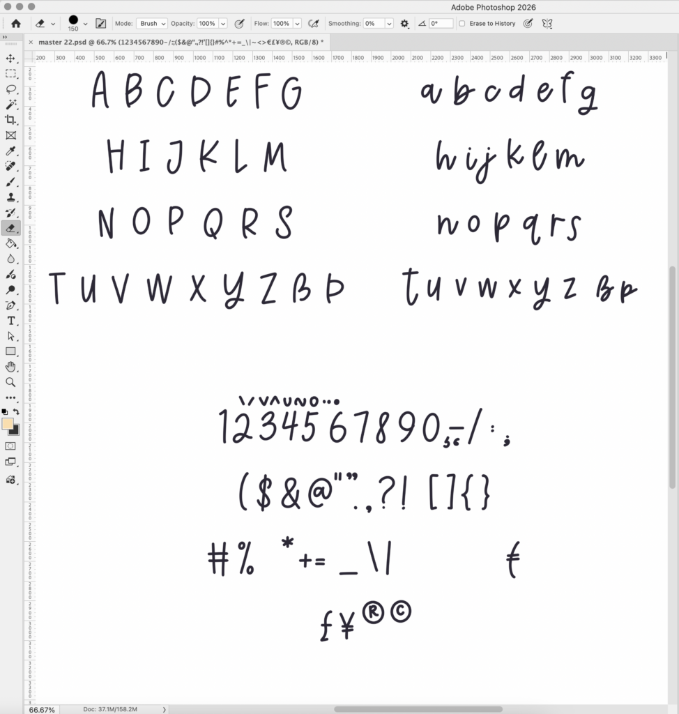
Here’s a quick little glimpse of a lettering file that I pulled from Procreate to Photoshop as a .psd file. This lettering is where Cinnamon Season started. Each grouping of letters here gets exported from PS as a .jpg file (so three total) and all three imported into Illustrator, which will take me to my next step.

Then comes the cleanup...

Handlettering is supposed to look handmade, but that doesn’t mean I leave every wobble, stray mark, or accidental blob exactly as it appeared in the original drawing. Taking a raster image from Procreate and transferring to my Mac is the first step, and then I need to convert everything to vector.

In a perfect world, every little bit that is lettered would be useable straight away, and if that was the case, Iโ€™d probably have thousands more fonts ready to go because Iโ€™d spend less time obsessing over details, jagged points, and unevenness. Every single character gets cleaned up so that it can be used in the font; every single character gets the same level of obsessive scrutiny.

This is one of those parts of font design that isn’t particularly exciting to look at, but it makes a huge difference in the finished product.
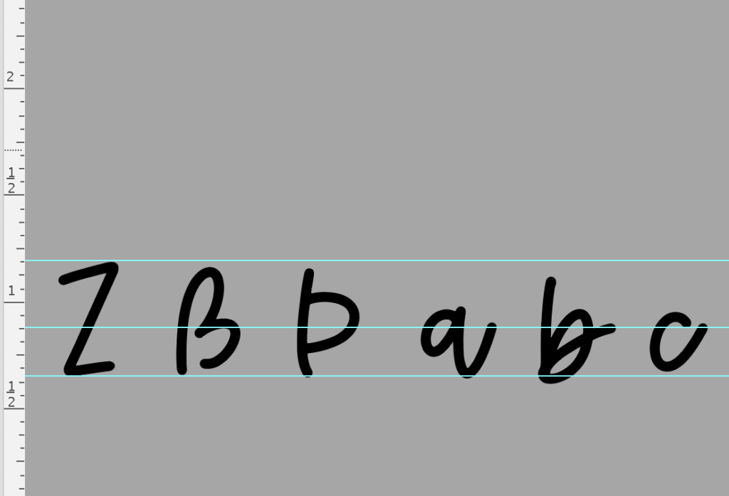
Here’s a little peek at that. Once the letters have been vectored, I line them all up using guides – one baseline, one cap height, and then I do a third one right in the middle. It’s not quite x-height for that guide – this is the guide that I place so that I know approximately where my exit stems will line up.ย 

Every letter has to play nicely with the others, and the devil is in the details.

One of the trickier parts of creating a font is making sure the letters work together.

A lowercase a might look fantastic by itself, but how does it look next to an r? What form of r will be used? What happens when you put an o beside a v? Does a script letter connect naturally to the letters that come before and after it? Would you like a ligature with that??

Spacing matters, too. You want to mess with a font designer?? Simply say, โ€œkerning pairsโ€ and youโ€™re likely to get an eye twitch. And letโ€™s not even discuss how one errant bearing value will wreck your entire programming experience, because when you try to fix that single value that you didnโ€™t realize was mistyped, youโ€™re setting off a chain reaction. Iโ€™ve nuked all of my programming before because of this exact thingโ€ฆstarted all over at the beginning.

The font has to work in the real world, in real world applications.

Once the characters are drawn, cleaned up, and working together (mostly), there’s still plenty to do before the font is ready for the wild. I test fonts in different words and phrases, check how they behave at different sizes, and make sure the characters work properly across the kinds of design software and projects people actually use them for.

For fonts intended for crafting, there are additional things to consider. A font that looks beautiful on screen isn’t automatically going to make a great Cricut font. Smooth edges, nice-looking shapes, and sensible details can make a big difference when the letters are being cut from vinyl or other materials.
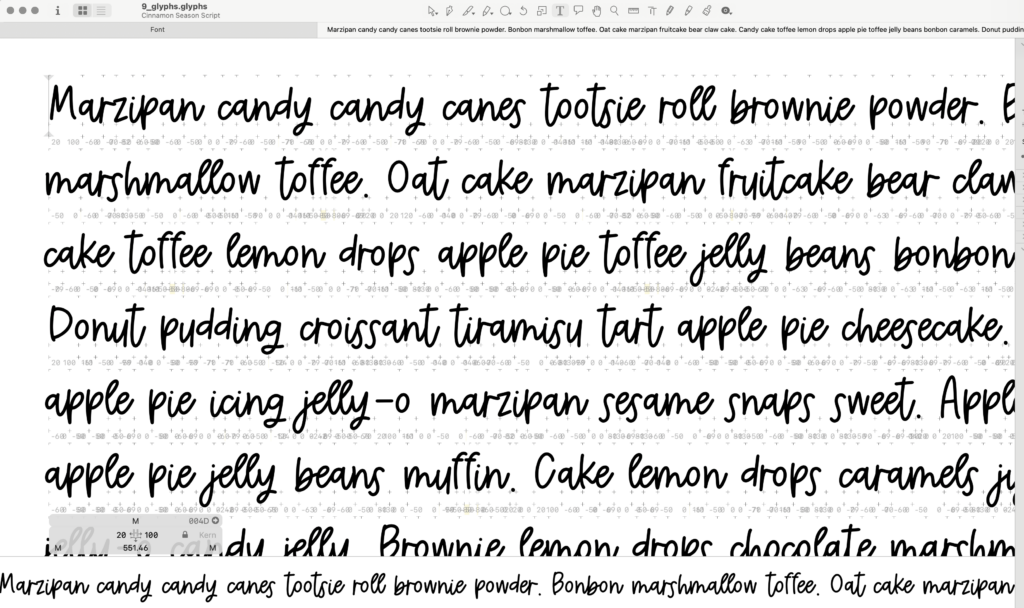
Here’s a little example of testing. I love Cupcake Ipsum for testing, but I do use a variety of ipsums and individual letter pairings in every case combination, in addition to many other text strings to adjust the font and uncover any possible issues.

Why handlettered fonts look a little different

One of the things I love about handlettering is that it doesn’t have to look perfectly uniform. In fact, I love the variance and imperfection that comes with a handlettered font. Oddly enough, sometimes itโ€™s difficult to create that type of detail when youโ€™ve been at it for a while and youโ€™re in autopilot to create a letterset that makes processing and programming easy peasy.

A handlettered font can have slightly uneven strokes, imperfect curves, and variations that make it feel more human. You can see in that image above that there’s a certain amount of “bounce” with the lettering – it doesn’t have an even baseline, not all letters connect with others. It’s a slightly neater version of handwriting, it looks & feels natural.

Sometimes, you might even come across ligatures where the characters run together, connectors are atypical and inconsistent. (The lowercase ng combo is one that stands out to me; the letters run together and loop around when Iโ€™m scrawling a note down.) That’s part of the point.

Those little imperfections are often what give a font its personality. Remember that what you’re seeing is more than a collection of letters. There’s a whole alphabet, a lot of drawing, a fair amount of cleanup, and quite a bit of very picky attention to detail hiding behind that little font file. Handlettered font designers need to decide how much irregularity is appropriate for the font theyโ€™re working on, all while trying to produce something that our customers will think is perfect for their project. Itโ€™s such a weird line to walk, but it is one of the challenges I love most about this job!

The font used in this post is Cinnamon Season.

What is a Handlettered Font? Learn More! Read More ยป

What Makes a Font Good for Cricut?

What Makes a Font Good for Cricut?

If you use a Cricut machine, youโ€™ve probably noticed that some fonts cut beautifully while others make you wonder why you ever decided to choose that font in the first place. Iโ€™ll say it straight up: some fonts are not good for cutting projects with your Cricut! Just because you can technically install the font and use it in Design Space doesnโ€™t mean you should. Cricut has fonts available for your use, both paid and free, which is fantastic because Cricut has already vetted those fonts for you. But sometimes, you have a very specific idea and you need an even more specific font for a special project, so maybe itโ€™s time for you to learn what makes a font good for Cricut so that you donโ€™t wind up frustrated with bad cuts or feeling like you’ve wasted money and materials!

What makes a font Cricut-friendly?

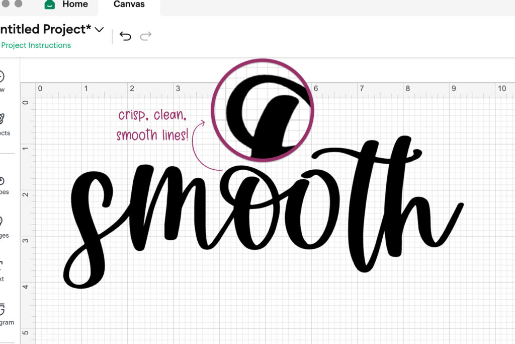
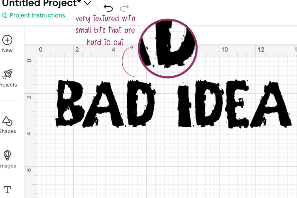
A good Cricut font should have clean, smooth edges that translate well when cut from materials like vinyl, cardstock, or HTV. Tiny bumps, awkward curves, overly complicated details, and extremely thin lines can all create problems. Brush fonts? Mostly no. Textured fonts with lots of sharp edges and cut-outs? Nope!! Can you cut vinyl with those fonts? Technically yes. Is it going to be a good cut? Almost always no. Youโ€™ll wind up with vinyl thatโ€™s torn and lifted up because your blade is gonna be working overtime for a cut like that!

So honestly, the best way to ensure that a font is Cricut-friendly is to make sure that it has a smooth appearance and that it doesnโ€™t have much texture to it. A font may look gorgeous on your screen, but if the letters contain lots of tiny details or fragile connections, those details can become difficult to weed or even disappear completely when cut.

Smooth edges are one of the biggest things I look for when creating fonts specifically suited to crafting. The goal is a font that looks good on your screen and behaves nicely when your Cricut starts doing its thing.

(Oh, and let me just put this disclaimer here – if youโ€™re cutting something large, you might be able to get away with a good-looking cut with a textured fontโ€ฆbut small sizes? Skip that, girl. Donโ€™t do it.)

Thin fonts aren't always better, even if they are smooth.

Super thin lettering can be beautiful for invitations, digital designs, and other applications where you’re working with a screen or printer. Cutting those same delicate lines from vinyl is a different story.

The thinner the details become, the more fragile they can be. This doesn’t mean you need to avoid delicate fonts altogether, but it’s worth considering the material you’re cutting and the size of your finished project.

For everyday Cricut projects, fonts with a little more substance tend to be much easier to work with. That said, if you have extra material and the inclination to test it out, go for it! Exploring limitations will only help you make future decisions as far as which fonts work for your crafty needs.

example of a smooth font for cricut design space

Smooth, clean font for Design Space | Autumn Love Script

Textured, ragged font – not good for Design Space | Unearthed Grungy Font

The material matters, too.

Even a very Cricut-friendly font can behave differently depending on what you’re cutting.

A design that works beautifully on permanent vinyl may be more difficult to cut from cardstock, and tiny lettering that works at six inches wide may be frustrating at two inches wide.

Before committing to a large scale project, it’s always a good idea to test your font and design at the size you actually plan to use.

What about fonts that aren't labeled Cricut fonts?

Remember just a few paragraphs back when I said that technically any font can be used in Design Space? Not all fonts carry the โ€œCricut fontโ€ descriptor. In fact, most font designers donโ€™t create their fonts with Cricut users in mind like I do, but the font may be perfectly amazing to use in Design Space because it meets the smooth edge requirement and cuts well at varied sizes.

Labeling a font as a Cricut font is an important distinction, in my opinion, because it makes your crafting decisions a little easier. Thatโ€™s why I make sure that fonts that are a good fit get that label! Itโ€™s been tested and vetted as a good fit, so you donโ€™t need to worry about it. Check the link below to see the fonts Iโ€™ve labeled as Cricut-appropriate, so you can get a good idea!

Cricut Fonts

A good font should make your project easier!

And, just so you know: you should treat fonts that you install for Silhouette Studio the same way! Clean, smooth edges for cutting are best for any vinyl cutting youโ€™ve got going on.

What Makes a Font Good for Cricut? Read More ยป

How To Create Your Own Font

Up until I took a Learn Font Making course in 2017, font design was entirely nebulous to me. I enjoyed handlettering, although I wasn’t very good at it then, and thought it would be badass to make fonts out of handwriting. I did so much research and tried to figure out the process to make my own font, but there were so many gaps in knowledge and information available. I’d all but given up on the idea, until I found the course I took that basically set me on the path that I’ve been on for five years. Font design is what I do full time now!

Since that time, technology and software has come a long way, and it’s made font design entirely accessible to pretty much anyone who wants to do it! I never thought I’d see the day that the process could be super simplified for anyone wanting to make their first font, but then I learned about Calligraphr.

Creating Fonts Just Got Easier

Calligraphr is a browser-based app that turns your own handwriting into a functional font in mere minutes. I’m not even lying about that – from the time I signed up to check this out to the time that I downloaded the .otf file, it was only a span of a few minutes.

It’s free to use. Yes, for real. Of course, there is a paid option that has more features, but you can literally start creating right after you sign up and confirm your email address.

It’s worth noting that you could probably use this to make your own sans serif and serif fonts, as well, but it seems like this app is mostly centered on using your own handwriting first & foremost.

How To Create Your Own Font

What Does Calligraphr Include?

Here’s the deal.

Calligraphr is free to use, but certain features are available only to paid accounts. You can create as many fonts as you like with free and paid accounts, but paid accounts have the ability to work on multiple fonts at once; free accounts can only work on one font at a time.

There are also limitations on the number of characters your font can have. Free accounts are allowed 75 characters. That’ll cover you for basics – uppercase and lowercase letters, numbers, and punctuation. Depending on what your font might be used for, you could include other symbols, such as less common punctuation marks, dingbats, and so on. You can choose what characters you’d like to include, or even the language. Clicking on the language for your own typeface will bring up the basic letters that you need to complete the font. For example, if you’re going to make an Arabic font, it’ll drop the Arabic letterforms in for you.

Paid accounts are allowed 480 characters. It’s a pretty large character set — or so you’d think — but a lot of professionally designed fonts (like what I offer) have far more glyphs included. It tends to spiral if you enjoy including a lot of extras and special characters like ligatures, alternates, and if you include language support with accented characters. I love including other characters in my fonts like swashes and various versions of letters. At any rate, 480 character spots will probably set you on the right path to a fairly robust font.

Free accounts do not allow for ligatures, nor do you have the option to adjust letter spacing for individual characters. You can, however, adjust the spacing for all characters, but you’re limited to all…or none.

Since Calligraphr is pretty much intended for handlettering, it’s smart to include the option for variations (alternates, stylistic sets) – free accounts allow for two variants per character; the pro accounts can have up to 15 variations.

Creating Your Own Font In a Snap

The process is simple. After you sign up, print the template. Draw your letters and symbols in the boxes. You can either scan the paper, or use your iPhone to take a picture of it. Upload it to Calligraphr.

This magical thing drops the letters into the appropriate boxes, you can make some adjustments, like where the character sits on the baseline and the size. You can adjust the size of individual letters, as well. Prior to “building” your font, you can adjust overall letter spacing, the font size (basically for display purposes in a preview) and you can also adjust word spacing (essentially the size of the space bar). You can edit individual glyphs, as well – the app gives you a few tools so that you can adjust your letters or clean them up a bit more.

Custom Font Files

When you click “Build Font,” the app generates two file types for you to download – .otf, and .ttf. The export options available don’t allow for other types, like webfonts. (But, let’s be honest, most people don’t need webfonts unless they’re a website developer.)

These files are totally normal files, all you need to do is double click to install on your computer. Doesn’t matter if you’re on a Mac or if you’re running Windows on your PC — it installs all the same, and you can access the font in any program that uses your system’s installed fonts.

How It Turned Out for Me

I mentioned the whole process took only a few minutes of time, and I’m not even joking about that. To be honest, I was completely surprised that it was as easy as it was. Calligraphr basically shields you from the complicated stuff that takes quite a bit of time to learn as far as the programming is concerned.

Depending on the font I’m working on, it can be a time consuming and long process adjusting all of the technical details within the font. With Calligraphr, it was a short, fast process, but that’s also because the option to make these adjustments simply doesn’t exist — either with the free account, or because the app doesn’t allow for a totally professional-grade, robust font. There’s nothing wrong with that, as long as you know what you’re working with.

So, check this out!

Here are is one of the sheets I printed (I wanted to try out the randomized variation option). I used my iPhone to take a fairly crummy picture, and it was uploaded right into the template. Easy peasy.

Here’s what it looks like after your letters are popped right into the boxes. They look a little pixelated, but when your font is generated into a downloadable file, the magical vectoring process happens so that your typography can be scaled to any size without the loss of quality.

I did test out some of the controls that were available to me – I only used the free version of Calligraphr so things like ligatures and being able to adjust kerning wasn’t available to me.

It would be silly for me to write all about this pretty cool thing without including an example of the font post-installation!ย  This is the result of less than five minutes of work on my part from start to finish.

And yes, I’m aware that my actual handwriting is complete crap.ย  No one would believe that I’m a handlettering artist.

How to Create Fonts Professionally – Calligraphr Limitations

My assessment? Calligraphr is fantastic if you want to create your own fonts for fun, or make a quick working font file, but it is by no means a substitute for professional software if you want to make a go of creating fonts professionally. The app offers you a way to create a basic font, but if you’re looking for a more powerful type of font creation, you need to turn to font creation software that the pros use.

I work with different software, depending on what stage of font creation I’m in. For all handlettering purposes, I use Procreate. After I’ve got my character set lettered, I transfer the lettering to Adobe Illustrator for vectoring and editing. Once I’ve got all of that set, I use Glyphs, which is professional font design software.

Glyphs offers a measure of control that every font design professional should have. There are other font programs that can be used (like Fontlab Studio) that offer the same type of control, but Glyphs is my personal preference.

I personally think that Calligraphr makes it easy to figure out if you’re actually interested in font design, and allows you to test the waters. If you’re new to handlettering and think you might want to dive into the world of digital resources by creating fonts, Calligraphr would give you a decent gauge on whether or not you want to continue practicing and honing your skills.

Be advised that professional software is more complex than Calligraphr. Calligraphr is a very stripped down type of thing, and all of the programming aspects are hidden from you and replaced with simple sliders or arrows to make an adjustment.

If you decide that it’s something you want to pursue, investing in professional software is crucial to creating powerful, feature-rich fonts. There is a pretty steep learning curve, but when you have a course that tells you everything you need to know about professional font creation, it makes it so much less daunting.

Enter the Learn Font Making course, where you can learn to create your own fonts professionally!

I will forever sing this course’s praises, because this is where I learned how to do what I do. Over the course of five years, I’ve got over 200 fonts created with almost as many in the works currently. (What the heck am I doing blogging right now, I’ve got so much work to do!!!)

Anyway, I’d also like to point out that the limitations with Calligraphr make it seem like a cursive or script font might be a smidge more difficult to make. In order to do this the right way, you would need a paid account so that you can adjust individual letter spacing to ensure that your exit stems connect properly with the next letters…but it doesn’t look like there’s any information available with regard to the kerning of individual letters with others. That feature alone will be crucial for a professional grade font. A handlettered font is great & all, but being able to dive into different styles easily does make a huge difference.

Can You Make Money From Font Design?

The short answer is yes. You can make money from font design.ย  Full disclosure – the post associated with that link was written at the very end of 2019 / early 2020, and in the years since, my income has only increased with font design.ย 

There are a lot of variables that should be considered. For example, the level of commitment you’re willing to have for things like social accounts, investing in ads, whether or not you want to have your own website or just use marketplaces to sell your fonts. Overall, though, yes, you can make money from fonts, but the amount is probably going to be based on how much time you’re willing to spend, and most importantly the caliber of font you’re trying to sell.

There are plenty of decent, well-made fonts out there that include only basics – upper and lowercase letters, numbers, basic punctuation. However, if you include language support (accented characters), you can command a higher price point. If you include extras – alternate glyphs, ligatures, swashes & flourishes – you can go even higher, if you wish.

While Calligraphr does allow for some alternates, and will allow you to have a nice number of characters in your font, it is not professional grade software, and it does not offer the measure of control that a professional font designer should have.

You can try to design fonts for sale with Calligraphr, but I would guarantee that you will hit a certain point with the app where you feel like you are incredibly limited with what you can do.

If you’re considering taking Teela’s Learn Font Making Course, you can try Glyphs out for free for 30 days, and experience the wonder of having full control programming your font. Since there is such a learning curve involved, here’s what I would recommend to keep your cost down as you decide how deeply you want to dive into this industry!

  1. Sign up for Teela’s course. At the time of writing this article, Teela’s next opening is August 2022. Work on your handlettering. Watch the course in full. This is an investment into something new, different, & interesting.

    Sidenote: I’ve had a few folks that I recommended Learn Font Making to make mention of the fact that they felt the course was costly. I have to disagree – I made back my investment quickly, including the investment in the full Glyphs software. If you have a gym membership that you pay for (investment in your health), or a Netflix account (investment in your entertainment), or you have a meal subscription like Hello Fresh (investment in your sanity if you work a lot, don’t have time to cook, or just suck at it), you should consider this an investment all the same. It’s an investment in education. People spend money all the time on things that they like to do, so if you like handlettering and you think it would be cool to make professional fonts and get paid for it, you should absolutely be signing up for this course. To this very day, I still say it was the single best investment I have ever made in myself & my creativity.

  2. Sign up for a free trial with Adobe Creative Cloud. You can get 7 days free, which should be sufficient to familiarize yourself with Adobe Illustrator, and get your font cleaned up appropriately.

  3. Sign up for the free trial of Glyphs. You can transfer your characters from Illustrator to Glyphs, and spend your free trial learning the programming aspect of fonts.

  4. If you decided to spring for Creative Cloud, create your branded font graphics there! You could also use a more simple program, like Canva, but you would need a pro account to upload your own font to create your branded images that show off your new font creation. A Canva Pro account has a free 30 day trial.

The TL;DR

Ok, the TL;DR usually comes first, but it seems so much more appropriate and chill than saying, “Conclusion” like a science project.

Calligraphr: Good for fun and experimenting with your own handwriting in font form.

Learn Font Making, and professional software like Illustrator and Glyphs: Good for a person who wants to do this professionally and earn some serious dough.

If you have questions about anything I’ve written here, or especially the Learn Font Making course, please drop me a line! I’d love to hear from you and tell you a little more about my experiences if you want to hear about them!

How To Create Your Own Font Read More ยป

How to Add Flourishes to Fonts in Cricut Design Space

What are font flourishes?

The first definition of “font flourishes” that springs to mind is simply this: decorative letters or glyphs. They are mostly used in calligraphy or digital typography – logos, invitations, or posters, for example. You can work with all kinds of fonts and apply the flourishes to almost any place you want to, if the font includes them.

This font trend has been around for quite a while now, but it continues to be popular among designers who are looking to give their projects an extra little something-something. There are thousands of free fonts online containing these types of lettering elements that you can use!

Check out the beautiful flourished "y" and "e" using my font Grateful Season!

What is a glyph?

A glyph is a specific character in a font, such as an “a” or an “x”. A glyph can also be a decorative letter or symbol that is used in calligraphy or digital typography, such as a swash or flourish.

The term “font flourish” is often used interchangeably with the terms “swash” or “alternate glyph,” but they are not exactly the same. A glyph is a specific character in a font, while a font flourish is a type of glyph that is used for decoration. Font flourishes can be simple or elaborate, and they can be added to any lettering style.

How to Access Glyphs in Cricut Design Space

In order to know how to add flourishes to fonts in Cricut Design Space, you will first need to know how to access your glyphs. Unfortunately, Cricut Design Space doesn’t allow you to see all of the glyphs of your fonts, so you will need to use either Font Book (Mac) or the Character Map (Windows/PC).

(Hopefully this is a feature that Design Space makes available in the near future.)

Accessing the font glyphs in Design Space can be tricky, so the process for PC/Mac is important to note! Once you’ve figured this process out once, it will be much easier in the future!

In order to add swashes to your font, the swash will need to already exist within the font’s glyphs. If the font doesn’t include swashes or special font characters in its glyphs, you will not be able to add flourishes to your font.

While I have PC instructions included in this blog post, the screencaps I’m going to show you are for a Mac computer, since that’s what I use for my design work!ย  You can also see a video of me demonstrating these steps here.ย  I’ve also got a video where you can see what it’s like to access special characters on an iPad so you can use them in Design Space.

Accessing Glyphs on Mac

While using a Mac, open up Font Book. You can find this in your Launchpad or by searching for the application in Spotlight Search (โŒ˜ + Space). Navigate to View > Repertoire, allowing you to view all of the fonts’ glyphs, rather than the sample that Font Book typically shows.

Now, choose the font that you wish to use from your list of all the fonts installed on your device. You will now be able to scroll through the included glyphs of the font selected to find the special characters that you wish to use. Select the glyph, then navigate to Edit > Copy.

This is what FontBook looks like and where to access the Repertoire feature to display all characters.

Accessing Glyphs on Windows/PC

While using Windows, you will need to open your Character Map in order to access fonts installed and their extra font characters. You can find this in your Programs or search for it in the Search Bar.

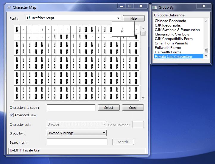
To begin, choose your font within Character Map. After this, choose Advanced View and click the Group By dropdown menu. Here, you will select Unicode Subrange, and a popup window will open. Once the popup opens up, scroll to the bottom and select Private Use Characters.

Now, you can scroll through the alternate characters and choose the special characters that you’re looking for. Click Select > Copy for the font glyph that you want to use.

This is what Character Map on a PC looks like and what you need to select - you can also find this image in my blog post about accessing OpenType features.

Using Special Characters and Glyphs in Cricut Design Space

Step 01

Copy the glyph from your font using the steps previously described within FontBook or Character Map.

Step 02

Now that you’ve chosen your glyph, return to Cricut Design Space where your design file is open. Using the Text Tool, add a new text box to your design and type out all the letters of the design in the same font that you chose your glyph from.

Step 03

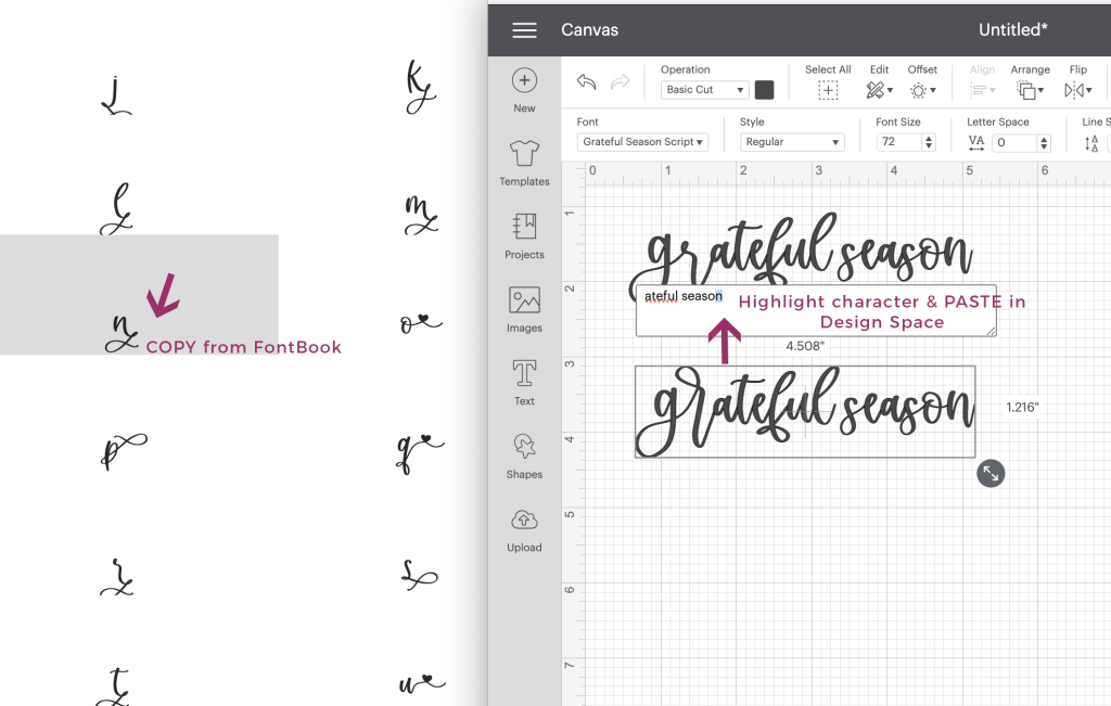
Move the cursor to where the special glyph is going and choose Edit > Paste in order to paste your alternate character into the design. Adjust the letter-spacing if needed in order to make the flourish flow with the rest of the font.

Keep in mind that once you use the special characters, if you change the font, the design will change drastically as the glyphs in each script font are different.

This is what FontBook looks like next to Cricut Design Space when you're trying to add special characters. Simply COPY the glyph from FontBook, and then jump over to Design Space, highlight the character you wish to replace, and then PASTE!

Step 04

Repeat the first step for as many glyphs as you need, pasting them into your design after they are copied each time. Add a new text box for more text or simply build onto the text that you have already typed!

Here's a close up comparison of the final changes. The top text shows standard characters typed out. The bottom text shows what it looks like when the "gr" ligature and flourished "n" were pasted in!

Pro Tip: If you’re using Design Space on your iPad or iPhone, you can download the paid app Unicode Character Viewer. The app is $1.99 (as of December 2025), and will allow you to look up fonts installed on your device, copy the glyph you’d like to use, and then paste the glyph into Design Space.

How to Add Flourishes to Fonts in Cricut Design Space Read More ยป

How to Download Fonts on iPad/iPhone – Installing Custom Fonts

This tutorial addresses how to download install fonts on your iPad or iPhone. You will need to follow the process outlined below to be able to use custom fonts in apps like GoodNotes or Design Space for your iPad.

IMPORTANT: Please be patient and aware of the fact that I, personally, do not make the rules + processes needed for font installation on your iPad or iPhone. I only create the font files, and have literally no control over the operating system, your device’s capabilities, or the rules the developers put in place for a process like this.ย 

That said, it is absolutely possible to use my fonts on an iPad or iPhone, but you must follow the process below, which includes downloading the files, extracting the files, and a few different steps using third party apps.

If you’re more of a watch-a-video kind of learner, I do have video demonstrations on how to download & install fonts on your iPad and iPhone.ย  You can find the iPad one here, and the iPhone one is here.

01. Download a Font Manager

Your new font(s) will need to be installed using the iOS configuration profile.

Using apps like AnyFont, Font Installer, iFont, and other font apps will allow you to download your font file and package it up so that it can easily be installed on your iPad or iPhone. You can install multiple fonts or choose one font to install!

For the purpose of this set of instructions, I’ve chosen to work with iFont on my iPad. At the time of writing this tutorial, iFont was a free app, which is why I chose it. There is a premium version, but I do not own it.

Below is a screencap of what the interface looks like!

02. Download Your Custom Font(s)

With some font apps, like the iFont app, you may be able to download Google fonts directly within the app from the font libraries. However, you can also download your Google fonts or custom third party fonts directly from your browser!

You would only need to follow the general download process as you would for any other downloadable file, unzip if necessary, and make sure you know where you saved the file!

iFont has an option to “Find Fonts to Install” — tap that, and then use “Open Files.” Navigate to where you downloaded the font file! Select the font you wish to install.

Important: Simply downloading the font does not install it. You need to follow the process, outlined below, to install the font so that it becomes available as a font option on your device.

I’ve chosen to work with my font Grateful Season for this blog post!

03. Install Fonts

After this, it’s smooth sailing! Next, install the font!

In iFont, you can do this by tapping “Installer” at the bottom left corner. It should have a little red bubble to indicate the notification – the red bubble will disappear when you tap.

When you tap Installer, you’ll see the font(s) you selected to install on the left side of your screen with a blue “Install” button. Tap install!

You’ll get a pop-up within the app after this. When prompted to open a configuration profile in your settings app, tap “allow”. Depending on your iPad settings, you may be prompted to enter your passcode.

After you do that, you’ll get a notice that says that the profile was downloaded, and it instructs you to review the profile in Settings if you wish to install the font. When you tap “Close” on the notice, you’ll find a set of instructions for what you need to do next.ย  Follow those instructions! (You can tap “Cancel” in the upper right corner of the pop-up to get rid of this before you go to your iPad Settings.)

You will receive a warning that the profile isnโ€™t signed with a key – that’s normal, don’t worry! You can see for yourself by tapping “More Details” and viewing exactly what’s inside: simply the fonts installed by you! A screencap of what that looks like is below!

Continue tapping Install for any other windows that pop up.

Now, tap “Done” when you receive the notification that it was installed.

04. Use Your Own Fonts

Now that you’ve installed your custom fonts, they will appear beside the default system font list in your apps. Simply choose your font in the list and use it to your heart’s content!

You can use in any app that uses the fonts installed on your iPad! (Some apps may not allow for custom font usage, so it is important for you to double check that the app itself accesses your device’s installed fonts. You can do that by contacting the developer, or by reading through any help files provided by the app.) I’ve got a screencap below showing you Procreate, which is a design app that allows you to use custom fonts!

Pro Tip: If you’d like to easily access the special characters within some fonts, you can download the paid app Unicode Character Viewer. The app is .99 cents, and will allow you to look up fonts installed on your device, copy the glyph you’d like to use, and then paste the glyph into the program you’re working in, such as Design Space or Procreate.

An Important Note:

Although this set of instructions uses an iPad, you can also install the fonts on your iPhone to be used in the same manner. iFont is available for download for iPhones, and you would follow the same basic process described in this post for iPhone installation!

Uninstalling Fonts

If you’ve decided that you’ve had enough of a new font and want to remove it, you can navigate to Settings > General > Profiles. Here, you can select a font profile and tap “Remove Profile” to remove the font from your system.

How to Download Fonts on iPad/iPhone – Installing Custom Fonts Read More ยป

Scroll to Top

Hi, I'm Beck!

Receive exclusive offers & freebies when you sign up for my mailing list!