What is a Handlettered Font? Learn More!
What Is a Handlettered Font?
If you’ve ever wondered what makes a handlettered font different from a regular font, the short answer is pretty simple: I actually handletter it. Ya know, write it. Not create it with a mouse doing a little clicky-clicky on my computer. (The clicky part comes later.) It almost feels silly to consider writing a blog like this, but leave no stone unturned, right?
I’m immersed in the hand lettered font world on the daily, so it seems second nature to me to know what a hand lettered font is and why it’s different from other types of fonts. But every expert was once a beginner, and understanding the creation process might help you down the road! I’m talking to you, crafters…graphic designers…anyone with an interest in lettering, letterforms, fonts, calligraphy. You get the point.
A handlettered font starts with actual lettering drawn by hand rather than being designed entirely from shapes, curves, and anchor points. That gives the finished font a more personal, organic feel. I’ve been obsessed with handwriting since I was a kid. I had penpals as a youngster and one of the reasons why getting mail was a favorite thing for me was because I got to see other people’s handwriting, and the variation that happens whenever you’re writing naturally. Letters can have variations in shape, stroke, spacing, and little quirks that make them feel like someone actually wrote them…because, duh, someone DID write it.
But getting from a piece of handlettering to a font you can install and use is where things get a little more involved!
It starts with the lettering...
When I create a handlettered font, I begin by drawing the letters. I almost always, like 99% of the time, do my lettering digitally on my iPad with Procreate. I think that it’s really convenient to do a little tap to erase my mistake instead of wasting paper and ink. It means no clutter, no sheets of paper, and even more writing utensils than I already have. I start with the alphabet, and then move on to numbers, punctuation, symbols, and accented characters. I love creating a robust, feature-rich font, so if it calls for it, I’ll work on alternate characters and ligatures, too. Script fonts can require even more work because the letters need to connect and interact with one another properly.
That alphabet you see in the finished font represents a lot of individual pieces of lettering, layers in Procreate, and going back to draw & draw some more.
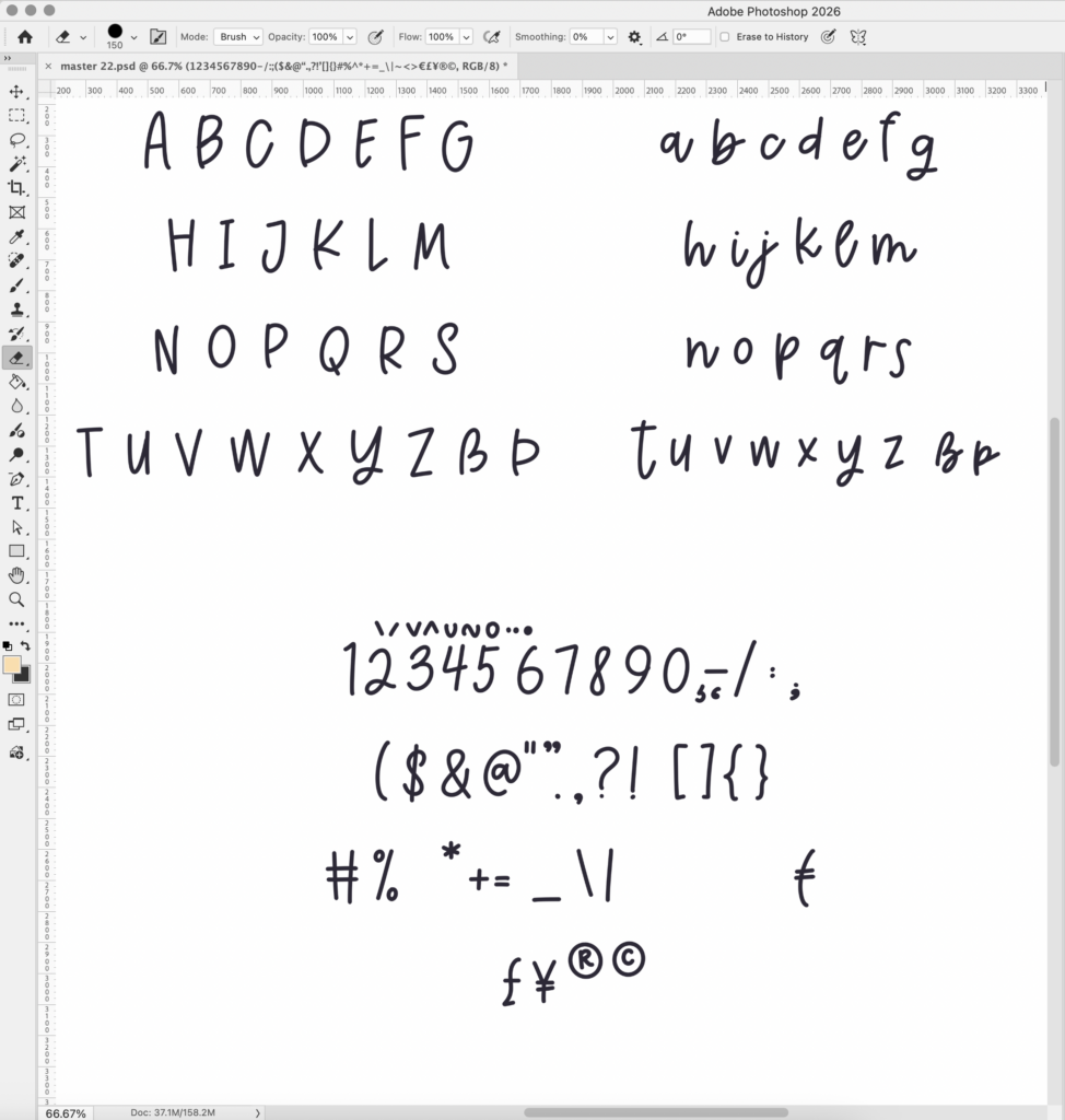
Here’s a quick little glimpse of a lettering file that I pulled from Procreate to Photoshop as a .psd file. This lettering is where Cinnamon Season started. Each grouping of letters here gets exported from PS as a .jpg file (so three total) and all three imported into Illustrator, which will take me to my next step.
Then comes the cleanup...
Handlettering is supposed to look handmade, but that doesn’t mean I leave every wobble, stray mark, or accidental blob exactly as it appeared in the original drawing. Taking a raster image from Procreate and transferring to my Mac is the first step, and then I need to convert everything to vector.
In a perfect world, every little bit that is lettered would be useable straight away, and if that was the case, I’d probably have thousands more fonts ready to go because I’d spend less time obsessing over details, jagged points, and unevenness. Every single character gets cleaned up so that it can be used in the font; every single character gets the same level of obsessive scrutiny.
This is one of those parts of font design that isn’t particularly exciting to look at, but it makes a huge difference in the finished product.
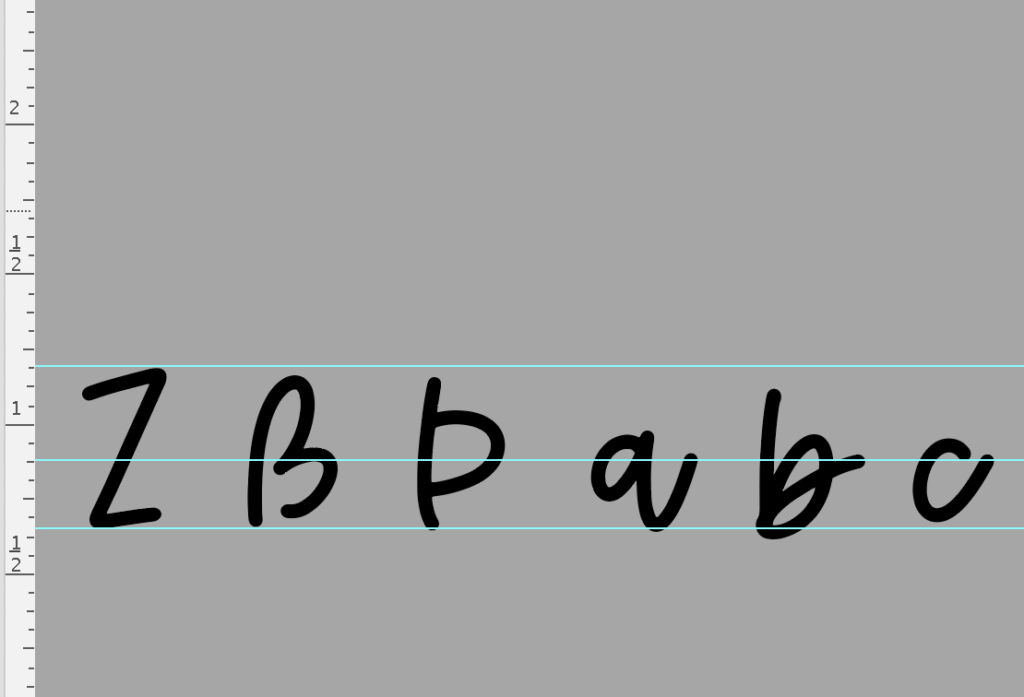
Here’s a little peek at that. Once the letters have been vectored, I line them all up using guides – one baseline, one cap height, and then I do a third one right in the middle. It’s not quite x-height for that guide – this is the guide that I place so that I know approximately where my exit stems will line up.
Every letter has to play nicely with the others, and the devil is in the details.
One of the trickier parts of creating a font is making sure the letters work together.
A lowercase a might look fantastic by itself, but how does it look next to an r? What form of r will be used? What happens when you put an o beside a v? Does a script letter connect naturally to the letters that come before and after it? Would you like a ligature with that??
Spacing matters, too. You want to mess with a font designer?? Simply say, “kerning pairs” and you’re likely to get an eye twitch. And let’s not even discuss how one errant bearing value will wreck your entire programming experience, because when you try to fix that single value that you didn’t realize was mistyped, you’re setting off a chain reaction. I’ve nuked all of my programming before because of this exact thing…started all over at the beginning.
The font has to work in the real world, in real world applications.
Once the characters are drawn, cleaned up, and working together (mostly), there’s still plenty to do before the font is ready for the wild. I test fonts in different words and phrases, check how they behave at different sizes, and make sure the characters work properly across the kinds of design software and projects people actually use them for.
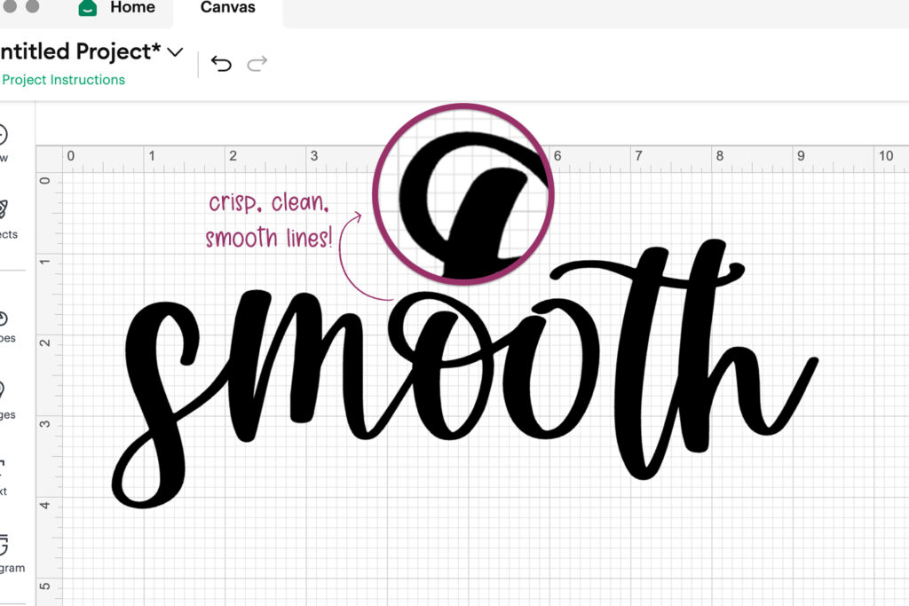
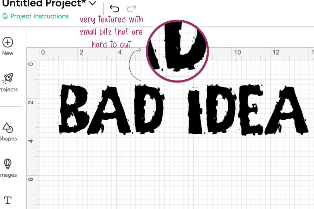
For fonts intended for crafting, there are additional things to consider. A font that looks beautiful on screen isn’t automatically going to make a great Cricut font. Smooth edges, nice-looking shapes, and sensible details can make a big difference when the letters are being cut from vinyl or other materials.
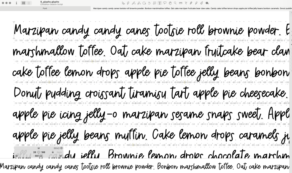
Here’s a little example of testing. I love Cupcake Ipsum for testing, but I do use a variety of ipsums and individual letter pairings in every case combination, in addition to many other text strings to adjust the font and uncover any possible issues.
Why handlettered fonts look a little different
One of the things I love about handlettering is that it doesn’t have to look perfectly uniform. In fact, I love the variance and imperfection that comes with a handlettered font. Oddly enough, sometimes it’s difficult to create that type of detail when you’ve been at it for a while and you’re in autopilot to create a letterset that makes processing and programming easy peasy.
A handlettered font can have slightly uneven strokes, imperfect curves, and variations that make it feel more human. You can see in that image above that there’s a certain amount of “bounce” with the lettering – it doesn’t have an even baseline, not all letters connect with others. It’s a slightly neater version of handwriting, it looks & feels natural.
Sometimes, you might even come across ligatures where the characters run together, connectors are atypical and inconsistent. (The lowercase ng combo is one that stands out to me; the letters run together and loop around when I’m scrawling a note down.) That’s part of the point.
Those little imperfections are often what give a font its personality. Remember that what you’re seeing is more than a collection of letters. There’s a whole alphabet, a lot of drawing, a fair amount of cleanup, and quite a bit of very picky attention to detail hiding behind that little font file. Handlettered font designers need to decide how much irregularity is appropriate for the font they’re working on, all while trying to produce something that our customers will think is perfect for their project. It’s such a weird line to walk, but it is one of the challenges I love most about this job!
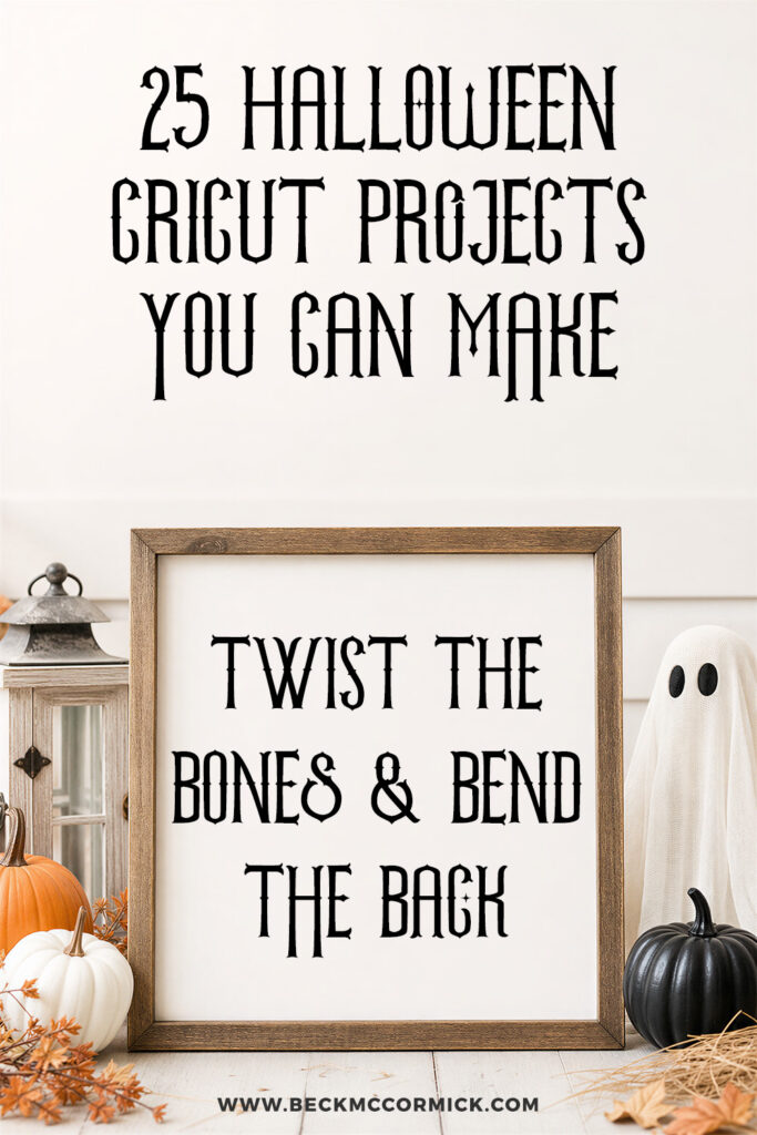
The font used in this post is Cinnamon Season.
What is a Handlettered Font? Learn More! Read More »